What Do the Different Safety Vest Colors Mean? A Definitive Guide
From neon yellow to bright pink, learn the critical difference between colors for compliance and colors for identification to keep your site safe and organized.
The Meaning of Safety Vest Colors Explained
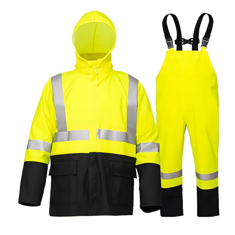
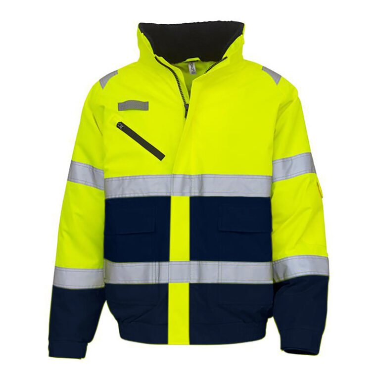
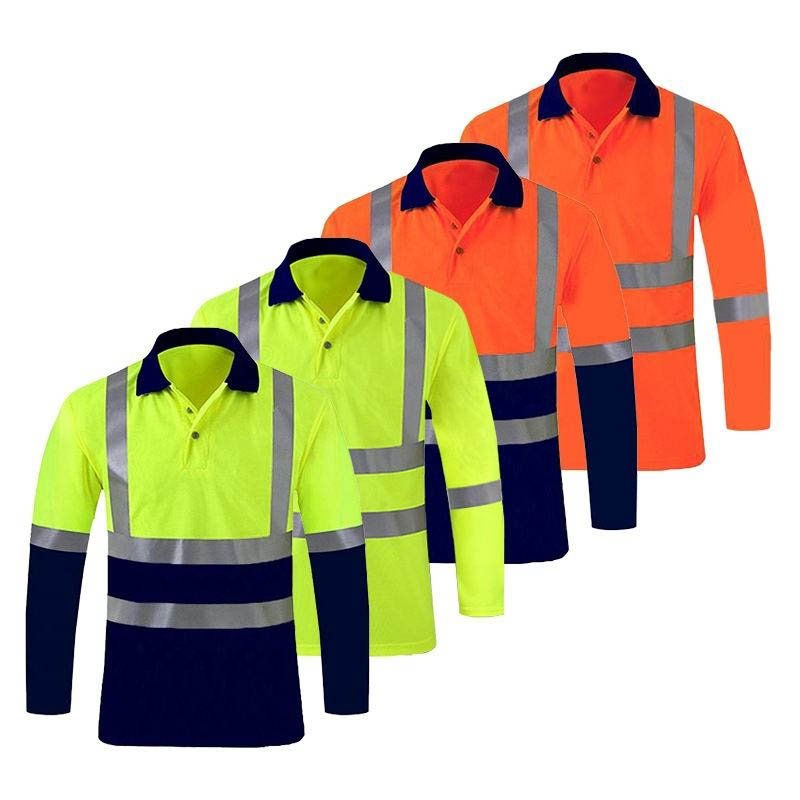
Safety vest colors serve two distinct purposes: **compliance** and **identification**. For compliance with safety standards like ANSI/ISEA 107, only three colors are approved for high visibility: **fluorescent yellow-green (lime), fluorescent orange-red, and fluorescent red**. These are scientifically chosen for maximum visibility against most backgrounds. All other colors—such as **blue, green, black, white, or pink**—are not ANSI-compliant for visibility and are used for role identification, helping to quickly distinguish personnel like visitors, safety officers, or managers on a busy worksite.
The Compliance Colors: ANSI/ISEA 107 Approved
When safety is mandated by law or company policy, you must use colors approved by safety standards like ANSI/ISEA 107 (USA) or EN ISO 20471 (Europe). The choice of these colors is based on science and aims to create the highest possible visual contrast for the human eye in a range of environments.
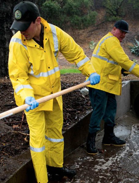
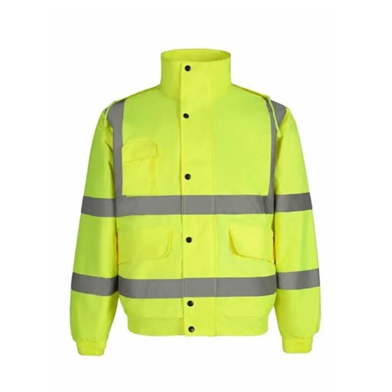
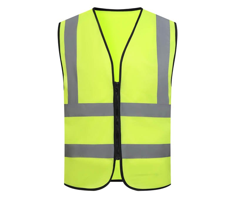
Fluorescent Yellow-Green (Lime)
This is arguably the most visible color to the human eye. It performs exceptionally well in low-light conditions like dawn and dusk. Its intense brightness makes it stand out against almost any urban or natural background, making it a default choice for general construction and roadway work.
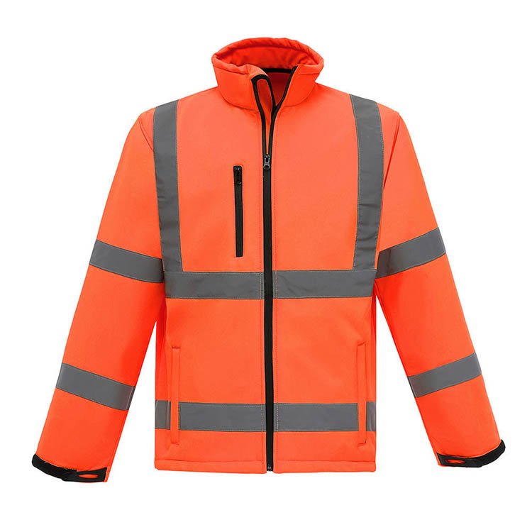
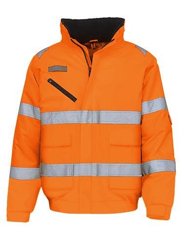
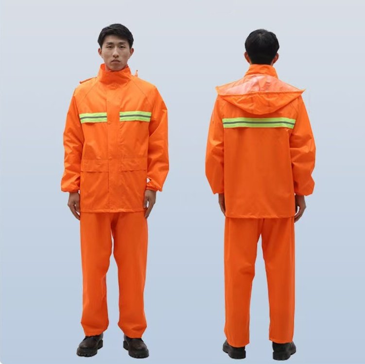
Fluorescent Orange-Red
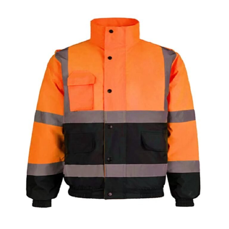
While lime green is bright, fluorescent orange-red offers superior contrast against complex backgrounds, such as snowy landscapes or a bright blue sky. This makes it a popular choice for road crews working on highways and for hunters who need to be visible against the foliage of a forest.
The Identification Colors: Organizing Your Worksite
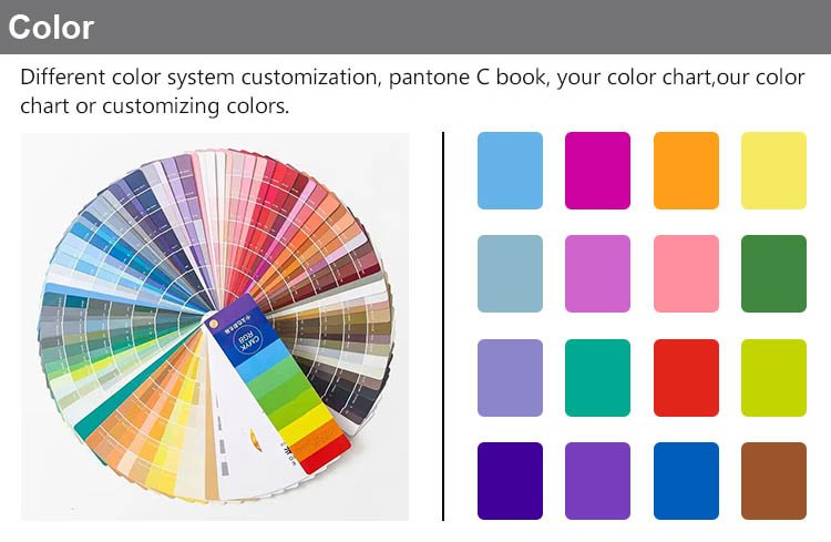
This is where the rest of the rainbow comes in. While these colors are **not ANSI-compliant for visibility**, they are incredibly effective for creating an organizational system on a busy site. There is no universal standard, but common industry practices include:
- 🔵 Blue: Often assigned to visitors, temporary workers, or technical staff like plumbers and electricians. It clearly signals that the person may be unfamiliar with the site’s specific hazards.
- 🟢 Green: Commonly worn by safety officers, inspectors, or new/probationary workers. The color green is universally associated with safety, making it a logical choice.
- ⚫ Black: Frequently used by supervisors, foremen, or security personnel. The color provides an authoritative look and, when paired with high-quality reflective tape, offers excellent nighttime reflectivity.
- ⚪ White/Grey: Typically reserved for site managers, engineers, or architects. It offers a clean, professional appearance.
- 🔴 Red: Almost universally designates fire watch, fire marshals, or personnel with emergency/medical training. The association with fire and emergency services is immediate.
- 🟣 Pink: Growing in popularity for event staff, charity-driven events, and often offered to provide a better fit and choice for female workers, promoting inclusivity.
A Global Exporter’s Insight on Color Strategy
In my years exporting hi-vis apparel worldwide, the conversation about color goes far beyond simple preference. The critical distinction I always clarify for clients is Compliance vs. Identification.
Official safety standards are almost exclusively built around two core colors: fluorescent yellow-green and fluorescent orange-red. The choice isn’t arbitrary; it’s about creating maximum contrast against the specific work environment.
Where do colors like pink, black, or blue fit in? These are for on-site role identification. We see this trend globally: a construction site might use blue for visitors, green for safety officers, or white for managers. And black vests, while not ‘high-visibility’ in color, are often requested by security or event staff who pair them with high-grade reflective tape for a more subdued, authoritative look at night.
So, my ultimate advice is always this: first, verify the required compliance standard. Once that’s covered, you can strategically use other colors to create an organized and efficient visual system for your team.
How to Choose and Implement a Color System
Ready to bring order to your worksite? Follow these three simple steps:
- Prioritize Compliance: First, identify all workers who are legally required to wear ANSI/ISEA 107 compliant apparel. They must wear fluorescent yellow-green, orange-red, or red. No exceptions.
- Assess Your Environment: Choose between yellow-green and orange-red based on your primary work environment. For work at dawn/dusk or in urban settings, yellow-green is often best. For daytime highway work or against natural foliage, orange-red may provide better contrast.
- Create Your Identification Key: For roles not mandated to wear compliant colors (or for layering over compliant gear), assign specific identification colors. Document this system and communicate it clearly to all personnel and visitors. For example: `Green = Safety`, `Blue = Visitor`, `White = Manager`.
Find the Right Color for Your Team
A well-thought-out color strategy enhances both safety and efficiency on site. Now that you understand the meaning behind the colors, explore our complete collection. Now that you understand the color meanings, come and choose the high-visibility vest you need.
Frequently Asked Questions
Is there a universal law for safety vest color codes?
No, there is no universal law that dictates what colors like blue, green, or black must mean. While standards like ANSI/ISEA 107 strictly define the colors for compliance (fluorescent yellow-green, orange-red, red), the use of other colors for role identification is up to the individual company or worksite to define. The key is to create a consistent, well-communicated system internally.
Can a black safety vest be safe for night work?
A black vest itself does not provide high visibility from its color. Its safety for night work depends entirely on the quality and amount of retroreflective tape applied to it. High-grade reflective tape will shine brightly when hit by light, making the wearer visible. However, these vests are not ANSI compliant and are typically used by security or event staff for a more subdued look, not for roadway workers.
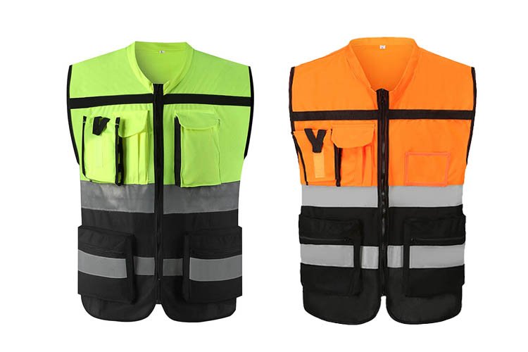
Why are two-tone vests (e.g., yellow and orange) used?
Two-tone vests are used to enhance visibility further by creating even greater contrast. Combining fluorescent yellow/lime and fluorescent orange on a single garment helps the wearer stand out against a wider variety of complex backgrounds. For example, the orange might contrast with a grassy or forested area, while the yellow stands out against a darker, urban background.