What Do Different Hi-Vis Colors Mean? (Orange vs. Yellow/Lime)
It’s a common question in workplace safety: Should we go with orange or yellow? The answer isn’t about preference; it’s about life-saving science.
The difference between hi-vis orange and yellow/lime signifies their suitability for different work environments based on color contrast. While both fluorescent colors are approved under safety standards like ANSI/ISEA 107, the choice depends on the background. **Fluorescent Yellow/Lime** is the most visible color to the human eye in most conditions and excels in urban settings against concrete and asphalt. **Fluorescent Orange** provides superior contrast in natural, rural, or snowy environments where yellow could blend in with foliage or bright landscapes. The final decision often comes down to specific industry regulations, such as the mandate for orange in the UK rail industry.
Expert Insight: The Two C’s – Contrast and Compliance
“From my vantage point dealing with global clients, the ‘Orange vs. Yellow/Lime’ question is less about which color is inherently ‘better’ and more about two key factors: contrast and compliance. I always steer the conversation away from personal preference and towards the specific work environment… For clients with teams working on highways that cut through forests in autumn, or in snowy, wintry regions, Fluorescent Red-Orange is the undisputed champion… Crucially, compliance trumps everything. My job isn’t just to sell a product; it’s to provide a compliant safety solution that ensures maximum visibility for a worker’s specific reality.”
– Senior Product Specialist, VizGlo Safety
Case for Yellow/Lime: The Brightest of the Bright
There’s a scientific reason fluorescent yellow-lime is so popular. The human eye is most sensitive to light in this part of the color spectrum, especially during daylight hours. This makes it the single most conspicuous color in a wide range of conditions. It pops against the grey, black, and muted tones of urban landscapes.
Ideal Environments for Yellow/Lime:
- Urban Road Work: Stands out against asphalt, concrete, and buildings.
- Warehouse & Logistics: High visibility in indoor, often artificially lit, environments.
- Airport Ground Crews: Provides maximum conspicuity on tarmacs and taxiways.
- General Construction: A great all-around choice for many construction sites.
Case for Orange: The High-Contrast Champion
While yellow/lime is technically brightest, it can sometimes be a liability. In environments with a lot of natural yellow, green, or white, it can lose its “pop.” This is where fluorescent red-orange shines. Its primary advantage is providing powerful contrast against natural scenery.
Ideal Environments for Orange:
- Rural/Forested Areas: Won’t blend in with fall foliage, spring greens, or tree lines.
- Snowy Conditions: Offers a stark, unmissable contrast against bright white snow.
- Railway Work: Often mandated due to its contrast against varied natural backdrops (see below).
- Hunting Season: “Blaze orange” is used by hunters for this very reason—to stand out in the woods.
Compliance is King: When Regulations Decide for You
Sometimes, the choice is made for you. While both colors are generally acceptable under ANSI/ISEA 107 (US) and EN ISO 20471 (Europe), specific industries and countries have their own overriding standards.
- UK Rail Industry: The RIS-3279-TOM standard (formerly GO/RT 3279) mandates that all high-visibility clothing used on or near railway lines must be fluorescent orange to avoid any confusion with yellow or green railway signals.
- Company-Specific Policies: Many large companies establish a single color policy for all their workers to create a uniform, easily identifiable workforce.
- Task Segregation: Some sites use color-coding for safety. For example, all designated signalers might wear orange, while all other general laborers wear yellow/lime, making it easy to identify key personnel at a glance.
The cardinal rule: Always verify the specific requirements for your region, industry, and worksite before making a purchase.
Quick Guide: Color Choice Chart
| Feature | Fluorescent Yellow/Lime | Fluorescent Orange |
|---|---|---|
| Primary Advantage | Highest scientific visibility | Maximum environmental contrast |
| Best For | Urban, warehouse, airport | Rural, forest, snow, railway |
| Potential Drawback | Can blend with bright/natural backgrounds | Slightly less visible than yellow in urban settings |
| Common Mandate | Great all-purpose choice | UK Rail (RIS-3279-TOM) |
Make the Right Choice for Your Team’s Safety
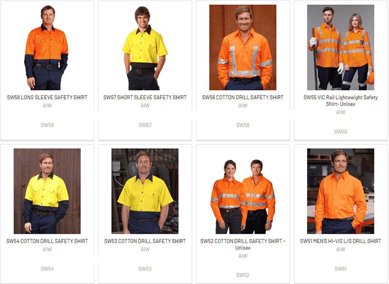
Understanding the nuances between hi-vis colors is key to ensuring your team is as safe as possible. Whether your environment calls for the supreme brightness of yellow or the powerful contrast of orange, VizGlo Safety has the compliant solution. As a leading OEM/ODM manufacturer, we can produce high-quality, certified garments tailored to your specific needs. Ready to enhance your team’s visibility? You can browse our selection of orange and yellow hi-vis shirts online.
Request a Custom OEM QuoteFrequently Asked Questions
Does the color matter at night? ▾
At night or in low-light conditions, the background color is far less important than the retroreflective material (the silver tape). The fluorescent color is for daytime conspicuity, while the reflective tape is what makes you visible in a vehicle’s headlights at night.
What about other hi-vis colors like red, pink, or blue? ▾
Colors like fluorescent pink, red, blue, and green are available but are typically NOT compliant with ANSI/ISEA 107 for use as background material in high-risk environments. They are often used for “enhanced visibility” or for identification purposes (e.g., event staff, specific teams on a site) where official safety certification is not required.